Observations on photographing art and color gamut

Normal people may want to skip this one. It is just a technical note.
Recently I did some experiments on photographing art, in this case watercolors. Unlike "normal" scenes that involve natural things, faces, hedgehogs and dogs, when you start to wander into the area of paints, you can get some pretty intense colors. As part of a larger experiment on understanding how to accurately photograph art, I thought I would investigate some gamut issues.
To do this, I placed two watercolor paintings, a set of "full strength" tube watercolor paint swatches (Daniel Smith, if you need to know) and a grey card in my living room under well lit, cloudy indirect light. The art was photographed with Nikon D80, with a Nikkor 18-200 lens set at 50mm (75 mm eq. for 35mm) at f8 in raw (.nef) mode.
The first time I entered Photoshop camera raw (ACR4), I set the white balance on the illuminated part of the Kodak 18% grey card. This seemed to correspond to a color temperature of 4950 K. The camera's "guess" at the white balance was 5000K. Both of these proved to be too "cool", and this is not unexpected, as normally we think of cloudy as about 6000K. I then set the white balance on the white paper itself. This came in at 5800, which is closer, but (no surprise) rendered the paper as white when in reality it is slightly warm. When I chose 6100K on the slider, the paper color looked about right on the monitor. As it happens, when subsequently printing, this still resulted in a printed color still a bit bluer than the actual paper. But this blog is not about color matching, it is about gamut, so I will stop.
I converted the image into Adobe RGB, 16 bit, and then looked at it in photoshop. I then set up to proof these under a variety of conditions, and looked at where I found out of gamut colors come up. But first, a reminder - even though I am in a wide color space, the camera could have already clipped some colors, and I would have no way of knowing. However, given that in general the printer gamuts are often the most limiting, and given what I found, it seems to me that this was not the case here.
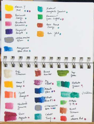
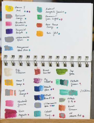
First, I selected an output space of sRGB, and looked at the gamut warnings. As it happens, this space was the most restrictive - it clipped parts (perhaps about 5%) of the watercolor paintings, especially blues and oranges, little bits of the golden wood, and about 20% of the full strength color swatches. Here is the gamut display, with the clipped colors shown as grey patches or dots:

It is also useful to note that since for web display, you render everything in sRGB, so the photo that appears at the top of this blog entry has already been clipped per the areas above - but at the same time, you can look to see that such clipping is not horrible, it just makes them less intense than in real life or when printed on a good printer. Also note that this first picture (and not the clipped gamut demo pictures) is the only one that is color managed properly at all - you can see that the paper itself is not white, but should show slightly warm.
Next, I selected my inkjet printer (HP D7160) with HP Premium plus glossy paper. This left everything unclipped except the full strength ultramarine blue color:
Next, I selected a profile I use for printing at Adorama. They print on Kodak Endura, a professional color print paper, and use the best processing machines out there. Here, there was some moderate clipping, a bit better than sRGB, but not as good as the inkjets:
Finally, I selected the profile from EZPrints (a profile I had downloaded a while ago) - they are also an online printer, and I think (but am not sure) that they offer prints using pigment ink. These can (if they use a 7 or more ink system) produce a somewhat wider gamut. Regardless of which printer they have, there was no gamut clipping in this case.
Normal people may want to skip this one. It is just a technical note.
Recently I did some experiments on photographing art, in this case watercolors. Unlike "normal" scenes that involve natural things, faces, hedgehogs and dogs, when you start to wander into the area of paints, you can get some pretty intense colors. As part of a larger experiment on understanding how to accurately photograph art, I thought I would investigate some gamut issues.
To do this, I placed two watercolor paintings, a set of "full strength" tube watercolor paint swatches (Daniel Smith, if you need to know) and a grey card in my living room under well lit, cloudy indirect light. The art was photographed with Nikon D80, with a Nikkor 18-200 lens set at 50mm (75 mm eq. for 35mm) at f8 in raw (.nef) mode.
The first time I entered Photoshop camera raw (ACR4), I set the white balance on the illuminated part of the Kodak 18% grey card. This seemed to correspond to a color temperature of 4950 K. The camera's "guess" at the white balance was 5000K. Both of these proved to be too "cool", and this is not unexpected, as normally we think of cloudy as about 6000K. I then set the white balance on the white paper itself. This came in at 5800, which is closer, but (no surprise) rendered the paper as white when in reality it is slightly warm. When I chose 6100K on the slider, the paper color looked about right on the monitor. As it happens, when subsequently printing, this still resulted in a printed color still a bit bluer than the actual paper. But this blog is not about color matching, it is about gamut, so I will stop.
I converted the image into Adobe RGB, 16 bit, and then looked at it in photoshop. I then set up to proof these under a variety of conditions, and looked at where I found out of gamut colors come up. But first, a reminder - even though I am in a wide color space, the camera could have already clipped some colors, and I would have no way of knowing. However, given that in general the printer gamuts are often the most limiting, and given what I found, it seems to me that this was not the case here.
First, I selected an output space of sRGB, and looked at the gamut warnings. As it happens, this space was the most restrictive - it clipped parts (perhaps about 5%) of the watercolor paintings, especially blues and oranges, little bits of the golden wood, and about 20% of the full strength color swatches. Here is the gamut display, with the clipped colors shown as grey patches or dots:
It is also useful to note that since for web display, you render everything in sRGB, so the photo that appears at the top of this blog entry has already been clipped per the areas above - but at the same time, you can look to see that such clipping is not horrible, it just makes them less intense than in real life or when printed on a good printer. Also note that this first picture (and not the clipped gamut demo pictures) is the only one that is color managed properly at all - you can see that the paper itself is not white, but should show slightly warm.
Next, I selected my inkjet printer (HP D7160) with HP Premium plus glossy paper. This left everything unclipped except the full strength ultramarine blue color:

Next, I selected a profile I use for printing at Adorama. They print on Kodak Endura, a professional color print paper, and use the best processing machines out there. Here, there was some moderate clipping, a bit better than sRGB, but not as good as the inkjets:

Finally, I selected the profile from EZPrints (a profile I had downloaded a while ago) - they are also an online printer, and I think (but am not sure) that they offer prints using pigment ink. These can (if they use a 7 or more ink system) produce a somewhat wider gamut. Regardless of which printer they have, there was no gamut clipping in this case.
1 comment:
Hi, that was a lot of fun and informative to boot. I would like seeing screenshots of the histograms.
My prints are done on an Epson Stylus Pro 9600 Series, color proofing by eye, more or less (a system which begs for improvement). The gamut is not as wide as for Iris giclée prints. Nevertheless it is far better than four-color lithography and it is possible to make cost effective prints this way.
With this monitor (kids' Christmas laptops) the first grey card is too warm, the second too cool. There is a lot of warm wood in the room so I expect reflection tends to warm it up. This is why my whole studio is painted grey, as are galleries.
Keep up the good work!
Post a Comment